First the fall:
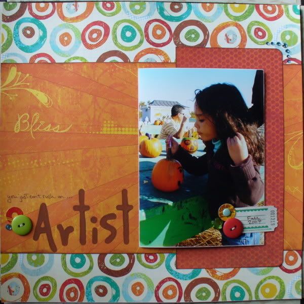
Love the colors in the papers... lots of strong gold, red and orange - which was a great fit for my layout of A~ painting a pumpkin last fall (notice the LONG hair!). The fun, freestyle circle paper really reminded me of art time and the colors were perfect. The sunshine printed paper was trimmed to let all the rays point to the picture. I added the title with foam stamps and paint to keep it in the artsy, handmade theme!
Next came spring:
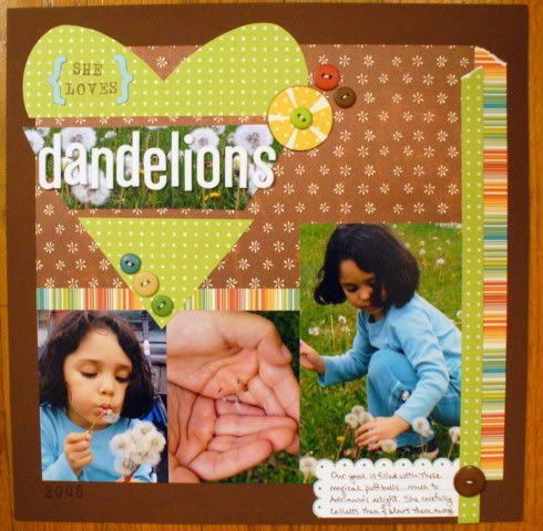
This line had a lot of dots on the reverse side... plus the brown paper with the little bitty flowers sent me searching for A~ dandelion pics from this spring (notice the shorter hair this time!). The little flowers and dots serve as a great repetition for the dandelion seeds that A~ was sending through the air. I used a sketch that one of the ScrapGoods design team ladies posted online in a challenge (sketch originally from Scrapbooks Etc Feb./Mar. issue). The giant heart was perfect... and these pics and paper were already just waiting on the desk for some inspiration to hit. I used a shot of the flowers thriving in my yard behind the title (sometimes I feel like the only green stuff out in the lawn is the weed collection). It's a good thing that I accidentally got a double... and one wouldn't stretch across the space. The little yellow flower was made with scraps and was inspired by some on Christine Middlecamp's blog.
Thanks for looking!
erin
