I forgot that I never posted the projects I made for the Scrapbooks Plus Design Team tryouts. So here goes....
This is my 2 page layout. Almost all of the papers in this SEI line were pinks, lavenders and grays, but the soft plaid patterned paper really worked with Adrianna's little plaid dress. I actually got in trouble for this one. Adrianna did not want anyone else to see these pics (so, shush... don't tell her!). She says that they are embarrassing. Who knew?!
The DT kit came with this really wide lace that is totally yummy. Adding a big folded flower was really all that it needed to come together. Simple and lovely!
We needed to make a layout that was not 12x12. I bought some 6x12 page protectors like a year ago.... so I decided to make something that size. I added some blue and green vellum - kind of reminded me of the colors of sea glass - and some buttons (my favorite embellishment).
This is one of my favorite photos of all time. The entire picture lifts so there is lots and lots of space behind it for journaling. It's still empty now.... gotta think of what I want to say! Hopefully I got the title right. I wasn't sure if it should be backward glance or backwards glance.....
thanks for stopping by!
erin
Sunday, January 31, 2010
Sunday, January 17, 2010
Snow and Spring
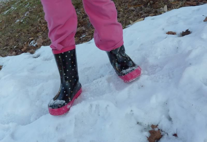
It's raining here today... and it just may melt away the last of the snow piles remaining from last month's blizzard. I know Adrianna is going to be sad about that. Every night when we come home, she gets out of the car and heads straight for the little mountains of icy snow to climb and slide around while I lock the car and get the mail. She's been begging for rainboots for months... so when she saw these at Walmart, her begging kicked into high gear. It worked and I caved and bought them. Now she is set for spring puddle-jumping! :)
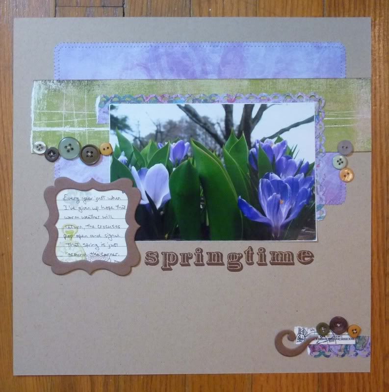
Speaking of spring.... I was reading the Pantone color report for my Big Picture Scrapbooking class "Inspiration Defined" by Elizabeth Dillow. I noticed that soft lavenders were back. Hmmm, I thought. Purples really aren't my favorite colors to work with. Perhaps I'll concentrate more on the turquoise and tomato red. Around the same time, I read on a message board that Becky Fleck was having a sketch contest over at PageMaps and went to take a look. I loved the sketch and decided to try to use one big picture instead of three small ones. Next thing you know, I pulled out this photo of the crocuses a couple of years ago and scrounged through my scraps for some purples. A little adjustment was all it needed to fit. I didn't make it in time to submit for the contest... but at least I finished it!
I totally love this layout and have it displayed on my cookbook stand. With the cold rain, it's good to have a reminder of spring to look at! My favorite part... the journaling tag from Webster's Pages in the Bo Bunny bracket frame and I love, love, LOVE the little orangey-yellow buttons... a perfect match to the stamens peeking out of the centers of the flowers. The little things make me the happiest!
much love,
erin
Sunday, January 10, 2010
Yarn It!
Too cold here to do much! Scrapbooking is taking a back seat to yarn arts. We've bought lots of yarn and a new loom. I already had a loom knitting books plus we visited the library for a couple of crochet books. Soon we will be covered in cozy creations! The loom went pretty well.... got this hat with half a ball of yarn and about three hours. I could probably do it faster now that I've got the hang of it. Adrianna wants to make me a scarf. I'm not sure she be able to keep it up long enough to get it finished, but we'll see! :)
much love,
erin
Friday, January 1, 2010
Good News!
The first piece of good news.... the computer is finally back and running. We are still reloading software, but what a relief to have it back! I am having a few issues posting and this site is making me type everything into the edit html box, but at least I'm in.
The second piece of good news.... I'm going to get to be on the Scrapbooks Plus Design Team again next year. I was a little worried as the SEI paper was tough for me to work with... foil and glitter accents aren't so much me. :)
Here are my January DT submissions. We used Upsy Daisy Designs - Man About Town line - which is full of soft blues and browns.
This one page layout is my mom and her sisters around 1957. I punched a lacey edge, crumpled it up and pleated it to make it more dimensional. The thicker title is painted with Tim Holtz crackle paint as well as the grungeboard accents.
A totally different style is this one-pager based on a monthly sketch from my fellow design team member, Loretta. I love the clean lines and finally pulled out those colored staples I had to have years ago! :)
This one page layout is my dad in 1969. I tore a piece of cork paper to add some texture. The title is made from some game-style pieces I picked up ages ago for a collage project that never made it to fruition. Isn't he handsome? ;-)
My final layout, my two-pager this month features our favorite ice cream place, Nathan's... it is wonderful! I use some circle punches and Jenni Bowlin chipboard buttons to create my own out of patterned paper. The eyelet holes give them a little more interest than just plain old paper.
That's all for now.... there'll be more later, I promise!
much love,
erin
Subscribe to:
Posts (Atom)